Benchmarking Dashboard
Problems
- It's hard to tell how successful you are on Handshake without anything to compare your metrics to.
- Customers want strategic advantages against those they're competing with for talent. Current analytics that aid them in this are manually created and only available twice a year in report form.
Team
Jake Becker (Product Director), Conor Quigley (Insights Program Manager), Vishal Shah (Insights Manager), Allison Orsoni (Product)
My part
Designer
Background
Insights as a product
Currently, Handshake sells an “Insights” product, which offers extra, personalized analytics to help advise your company on how to build a better pipeline, optimize outreach, and more. As part of this, we provide a “Benchmark” report twice annually as a PDF that compares you to your peers on several dimensions.
Putting benchmarking in product?
Is this a dynamic in-product dashboard or embedded Looker? In the past we've embedded Looker iFrames for similar reporting purposes. This allows people to explore data cheaply, but it's difficult for people not trained in Looker to use. It also makes us more dependent on third-party software. In the end, we decided to invest in building it in product.
Is benchmarking its own report or spread it throughout the product as a layer? While the latter would theoretically work well to put the information in context, having it as its own report allowed us to touch fewer surfaces and made it easier to productize & demo it more easily.
Research
There's so much data. What to include?
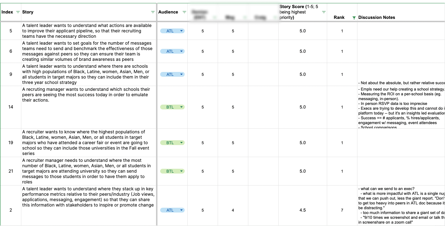
We leveraged our Success team, who is on the phone with our premium customers all day every day, to help learn what questions employers are asking in regard to their peers.
We didn't want to show data unless there was a business case for how it could help our customers. So we brainstormed questions to ask of the data whose answers could be used to gain an advantage in recruiting.
Sketching
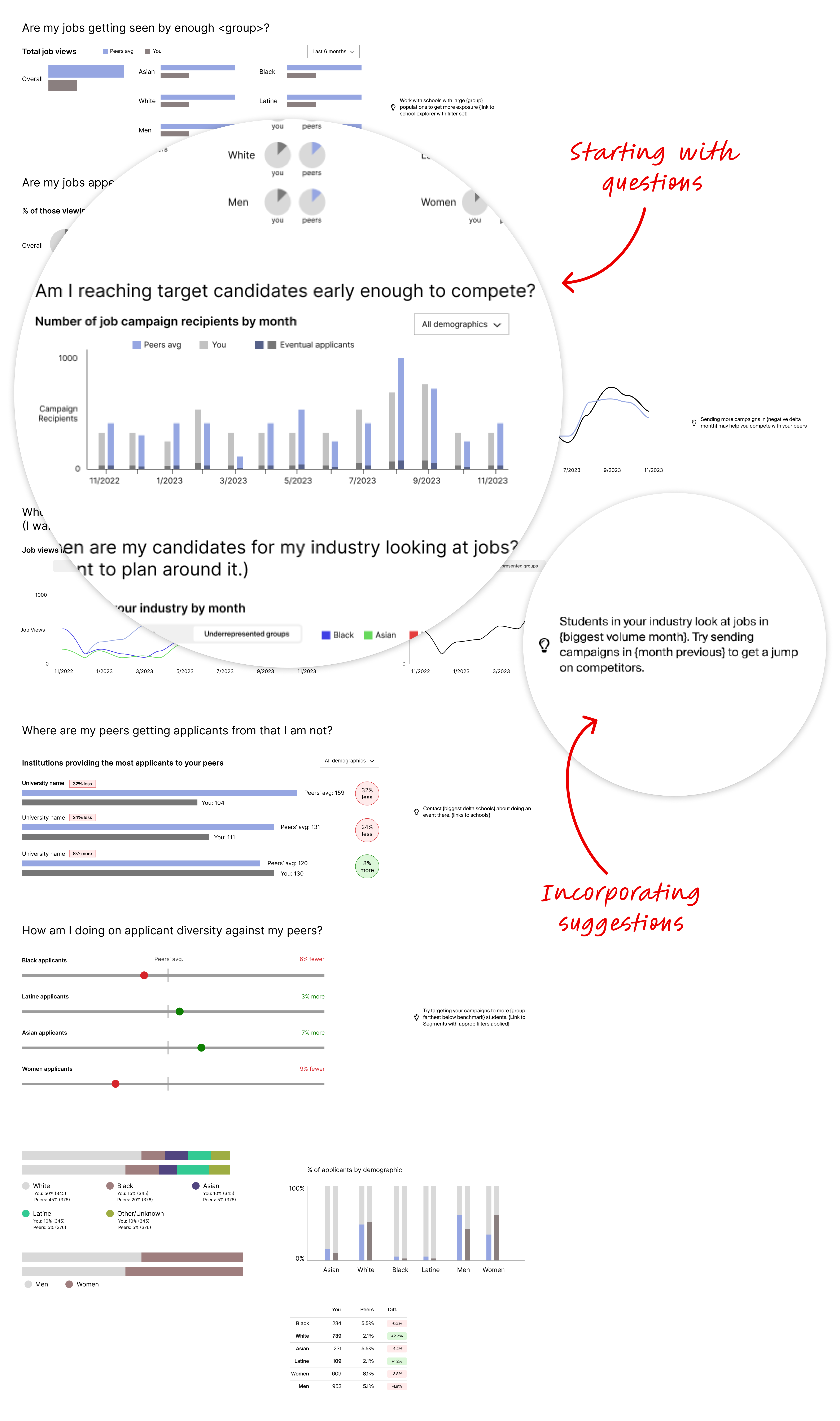
For initial sketches, I used questions as a guide and thought about how each could be answered with data in the clearest way. I also thought about programmatic suggestions we could provide in-line. I tried different ways of visualizing the data in each section (including plain data tables when applicable).
Exploring options
There are a ton of different ways to visually express a data set, and I wanted to choose the one that would best help our customers answer their questions. I made sure to mock up every potential expression I could think of.
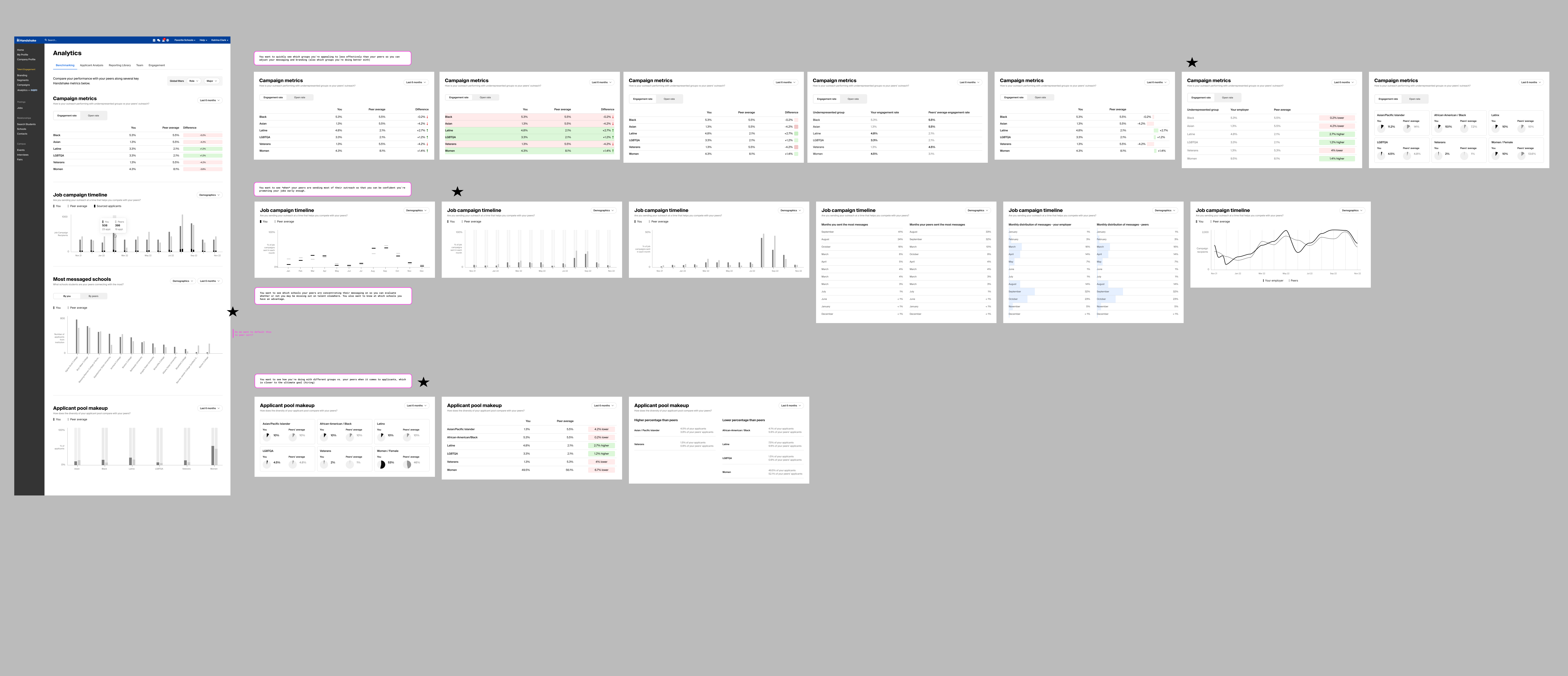
We settled on a basic structure of:
- headline
- question
- toggles and filters
- chart or table
- optional table view or download for accessibility
We also decided to wait on suggestions for the time being, until our system became more sophisticated.
Narrowing
Summary section
Starting off with a high-level summary has always resonated with users in my experience, even if it doesn't directly get at burning questions. So we went with three key success metrics and how they compare with peers.

Institutions (schools)
For director-level persons, one of the key strategic decisions they need help with is choosing which schools to put their dollars toward. Knowing how you're doing vs. your peers at different institutions helps inform those strategies.
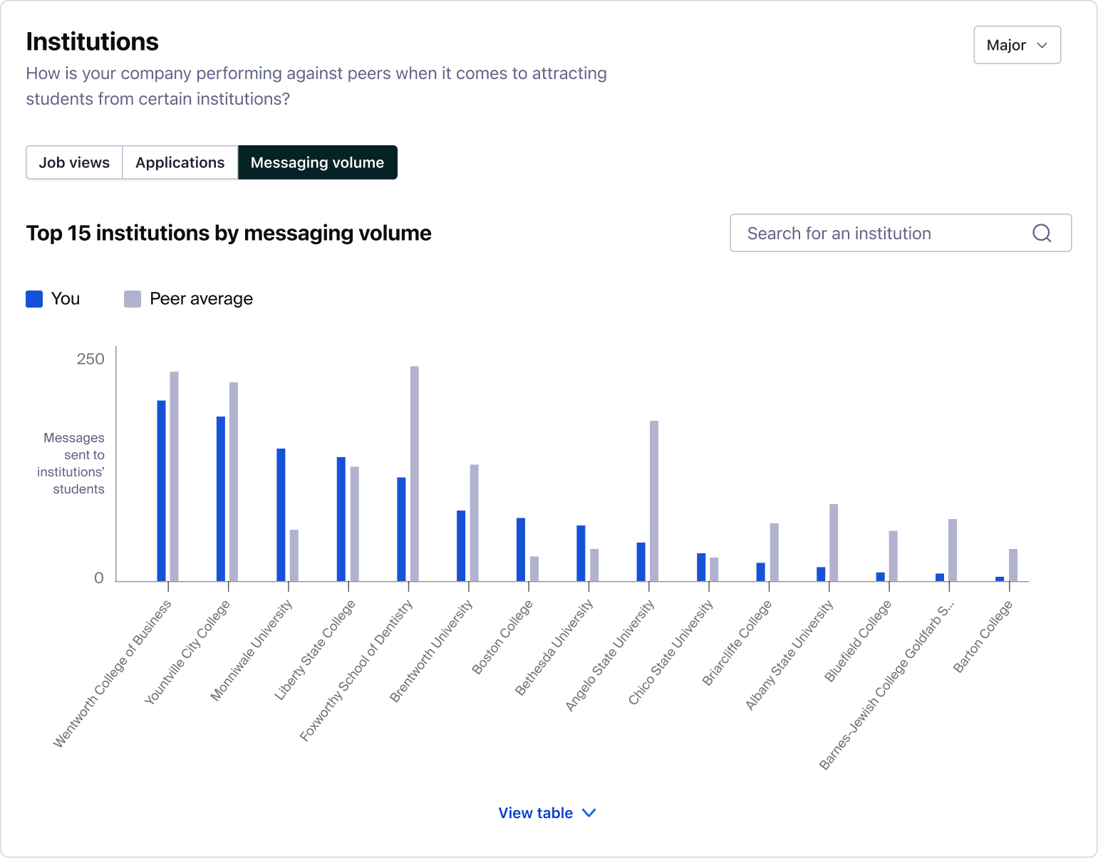
We thought using the top 15 schools you interact with would cover most use cases, and then they could use search if they needed information on a specific school.
Underrepresented groups
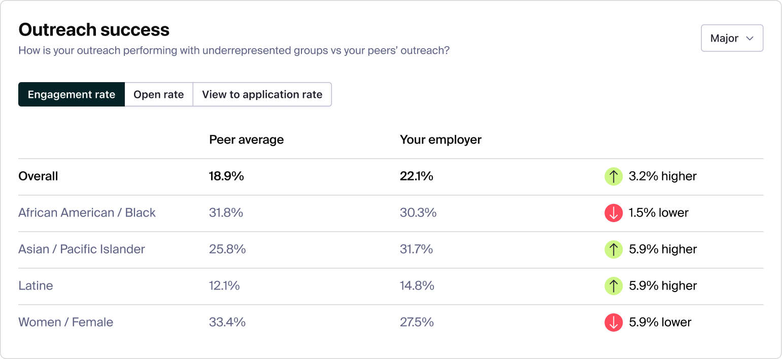
When it comes to larger companies who invest in Handshake, many are trying to build diverse teams and need to compete for talent from specific demographics they might be struggling to recruit. We had two sections centered on those needs.
The first was how successful your outreach has been for those groups. If you have lower open rates, for example, it can suggest your subject lines need work.
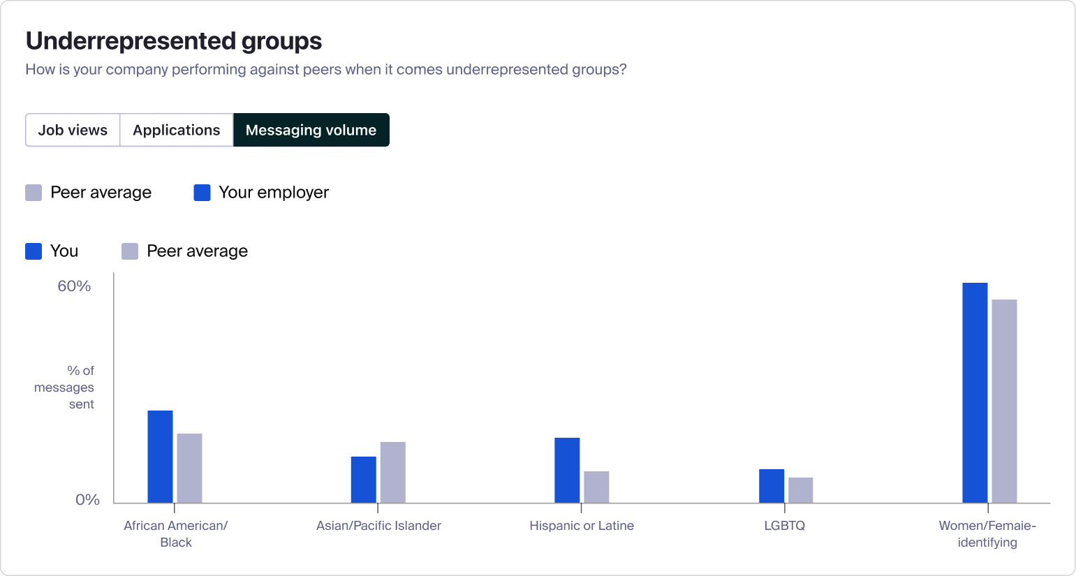
The second was more general: how you've been doing on applications, job views, and messaging volume.
Timeline
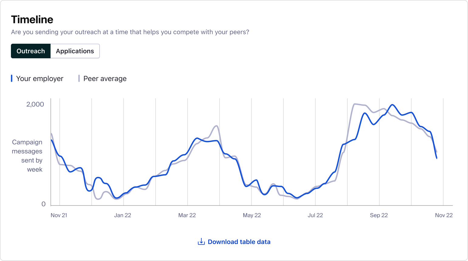
Another big questions our employers had was around when to start recruiting in order to be competitive. We try to answer that by showing when their peers tend to have messaging spikes. We also wanted to show generally when students were applying to jobs at their peers.
Applications to other employers
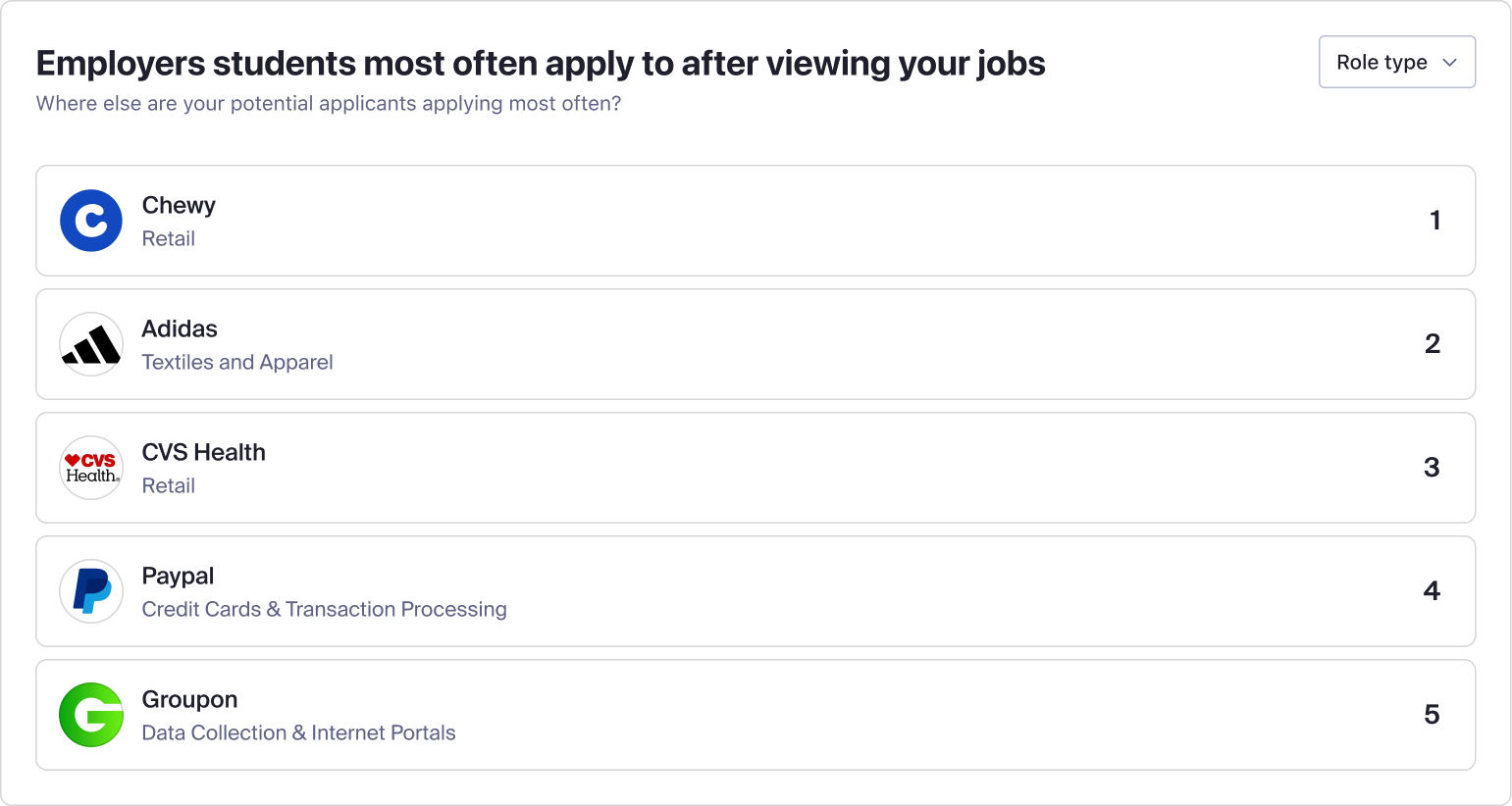
Lastly, employers wanted to know who they might be losing talent to, so we provide a list of top employers they apply to after viewing one of their jobs.
Putting it together
We put it all together and added a time filter with past 1, 3, 6, and 12 month options to start. We also added a link where they could reference who their peers were in case they'd forgotten.

Beta feedback
Before launch in June 2024, we held a small beta with around 5 interested Insights customers (a few giant organizations and some more medium-size ones), and consolidated feedback in a May 2024 onsite.
The positive
We got a lot of positive feedback on the UX and the clarity:
- "Charts are intuitive and clear...can find what we need quickly"
- "Access at our fingertips is great and was needed...it feels familiar and intuitive"
- "Easy to use and understand"
- "The charts are intuitive"
- "The date ranges are useful"
Improvement opportunities
A lot of the constructive feedback was around the use of volume metrics instead of percentages in a few areas. When comparing to companies much larger than your own, volume metrics can look bad or, with dynamic charts, can become less legible.
- "Volume metrics are not great for reporting when the employer is smaller than peers"
- "Seeing the % difference on the volume metrics would be helpful"
- "When peer average and employer average is very different, then the scale of the graph makes it hard to read"